MedRespond
Redesigning a conversational healthcare enterprise product

Team: Rayna Allonce, Lisa Carter, Rufei Fan, Nur Icel, Lily Pai
Role: Product Designer & Project Manager
Timeline: 8 months, January 2019 - August 2019
AI/ML, UX/UI Design, UX Research, MedTech
Overview
MedRespond is a conversational healthcare enterprise product meant to serve as a patient-centered application for health, knowledge, and communication. In this 8-month-long masters capstone project my team and I worked with MedRespond to deliver scalable, interactive, and personalized communication solutions for their patients and clients — focusing first on the liver transplant program for Cleveland Clinic patients and care givers.
As our team’s project manager I was responsible for developing our team’s high level research, design, and prototyping strategy, driving project timelines and deliverables, and ensuring team cohesion and collaboration. I also developed and provided oversight on research methodology, conducted user interviews, led and participated in design workshops and concept ideation, and created design artifacts such as personas, storyboards, service blueprints, customer journey maps, wireframes, and prototypes.
THE CHALLENGE
How might we envision a preferred future for conversational patient & caregiver engagement that addresses the medical, behavioral, and emotional dimensions of healthcare?

Existing MedRespond experience
Design Goals
Evaluate the current MedRespond Experience
Identify opportunities to improve user emotional engagement
Design, prototype, and validate new designs with end-users
Define a “preferred future” for MedRespond
Business Goals
Help liver transplant patients and caregivers manage their condition 24/7
Provide critical information down to details
Increase medication adherence and decrease rehospitalization rates (70% reduction in costs)
THE SOLUTION
A patient and caregiver-centered redesign that holistically addresses patient and caregiver health concerns, delivered by an engaging conversational experience.
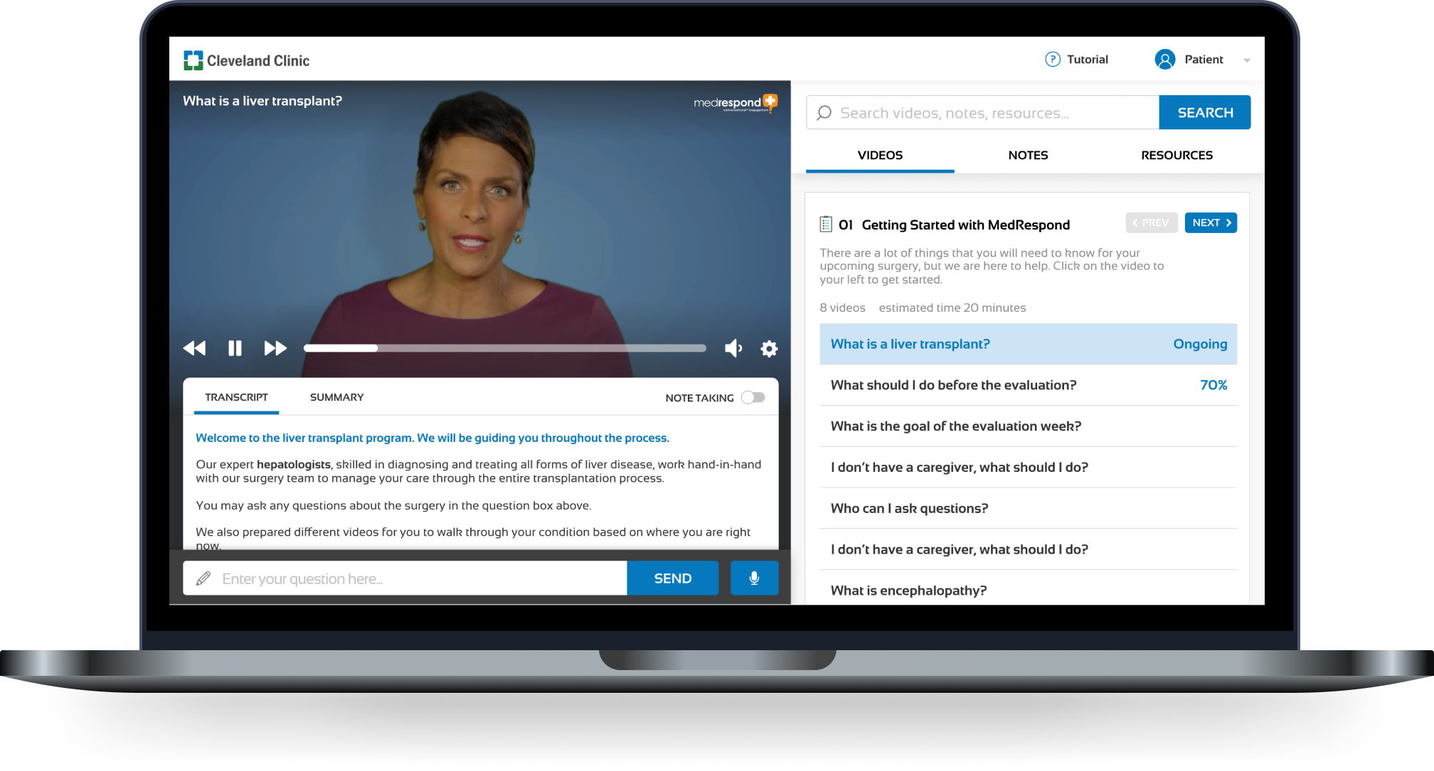
Redesigned MedRespond experience
In addition to a redesigned experience, our team also produced in depth analysis of the current Medrespond experience and synthesized insights and artifacts gained from primary research with over 88 patient, caregiver, and subject matter expert.
Final Deliverables
Detailed redesign specifications for desktop
Design specifications for a future thinking mobile experience
Patient and Caregiver personas
Customer Journey Map
Bullseye (stakeholder map)
Service Blueprint
Four detailed research reports
Light-weight design system
Detailed documentation to assist technical implementation
Proposed product roadmap
Redesign Summary
0: Information Architecture
Mapping to mental models and progressively disclosing complexity

Current MedRespond
Redesign
1: Conversation Redesign
Leveraging conversational AI to set MedRespond apart from other healthcare platforms
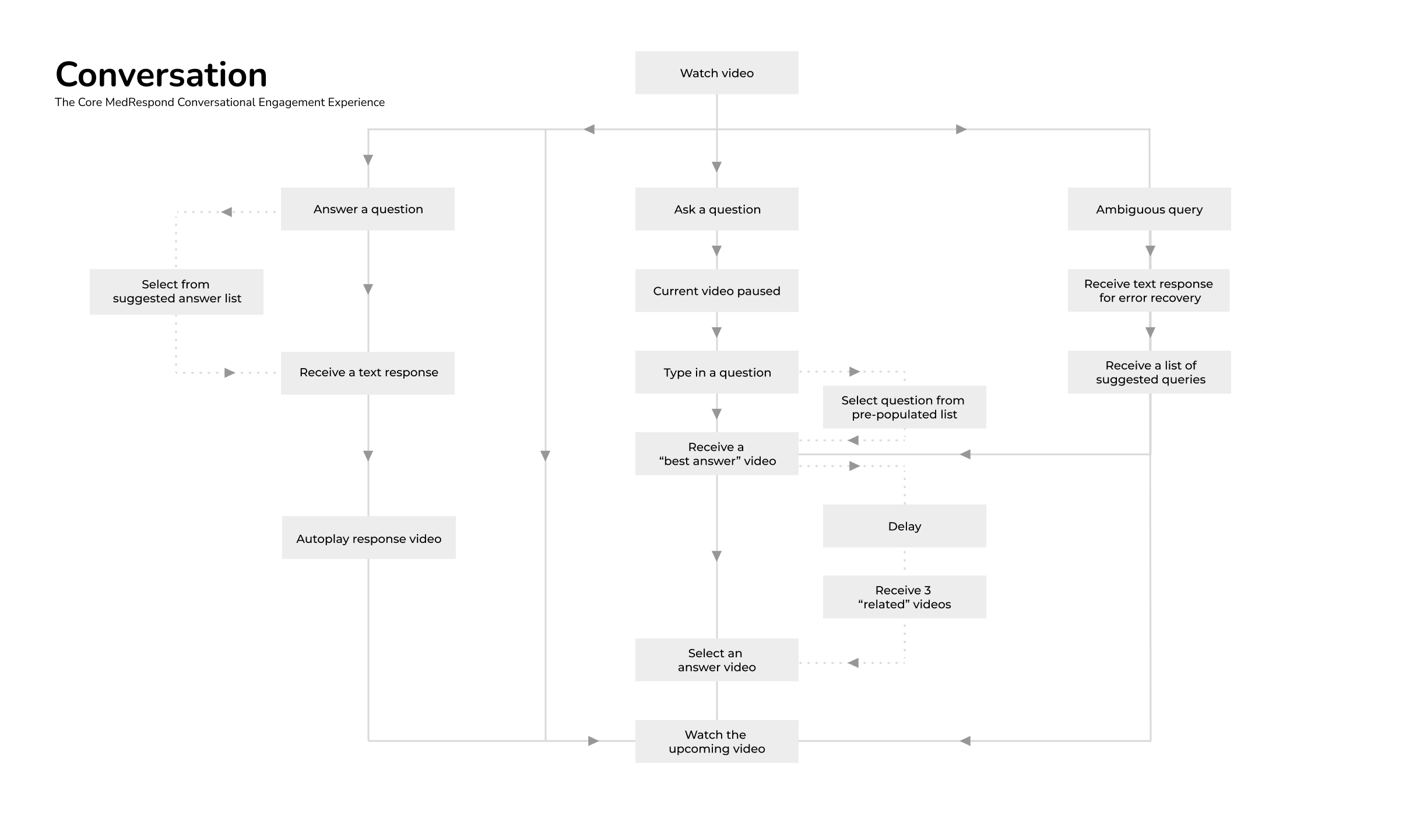
As conversation engagement is the cornerstone of the MedRespond value proposition, our primary focus was in demoing our overhaul of the following conversational features: question input, answer output, and error recovery. We also explored experimental conversational design with concepts such as immersive mode or voice-user interface.
Using the power of natural language processing (NLP), MedRespond’s product places an emphasis on natural conversational engagement to mimic real doctor-patient interactions. With the rise of conversational design, our goals were to enhance the conversational platform to be more engaging and intuitive, using both elements of conversational interface design as well as high-level visual and interaction design.

-
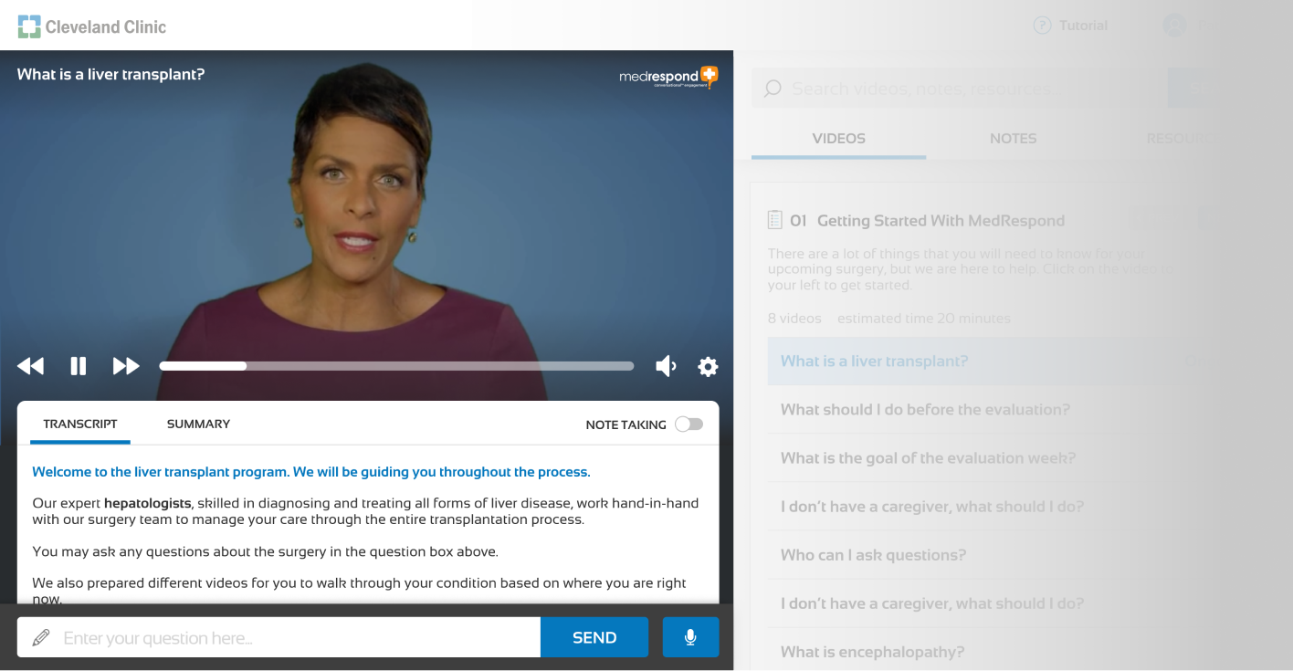
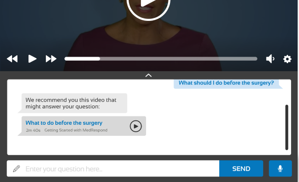
The key interaction of our conversational user interface (CUI) focuses on the ability to search for content by asking questions. In the question box, users are encouraged to type in questions similar to what they would ask a medical professional. From there, the natural language processing takes the query and runs it against the available videos in the platform database, matching the correct video to the user’s query and loading it for the user.
-
Some of the videos on the platform include an interactive component where the system asks the user a question. In these instances, users are encouraged to respond with either one of the suggested responses provided in the chat feature, or by typing in their own response. Based on the user’s input, the NLP follows up with the appropriate response to the user’s answer, simulating natural conversation.Item description
-
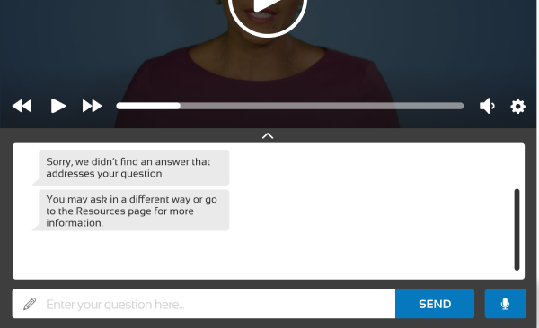
While there are hundreds of videos available to answer a variety of questions, sometimes there is a gap between what the user wishes to know and the content that is currently available to them. Two use cases where this can happen include:
1) A user types in a query that does not match any of the videos available in the database (ex: “What is your favorite ice cream flavor?”)
2) The NLP makes an error in translation and provides the user with a video that does not meet their needs.
Such types of errors highlight the need for smooth error recovery within the NLP, particularly in a platform that requires a great deal of trust from a user base that’s already under a great deal of stress. When a user requests content that doesn’t match any of the NLP, the chat interface responds with an apology akin to Siri’s “I’m sorry, I’m afraid I don’t have an answer to that.” The platform also suggests the closest related videos to that question to help guide the user closer to related information, even if it wasn’t the exact content they were looking for. Over time, this can help the user shape expectations and learn to frame questions in ways the computer can understand.
2: Navigation Redesign
Intuitive navigation that helps chronologically center the patient in their journey
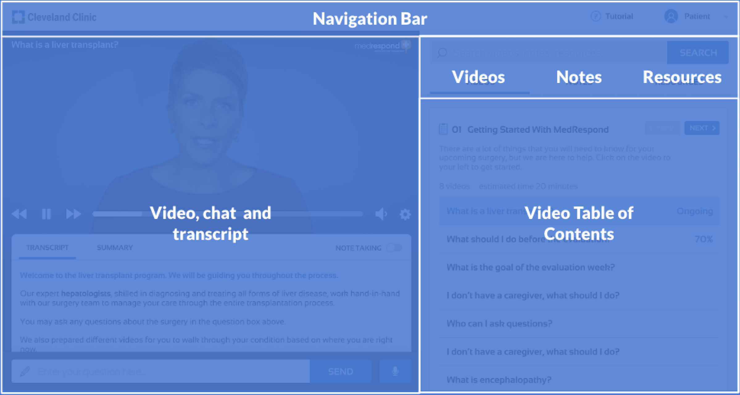
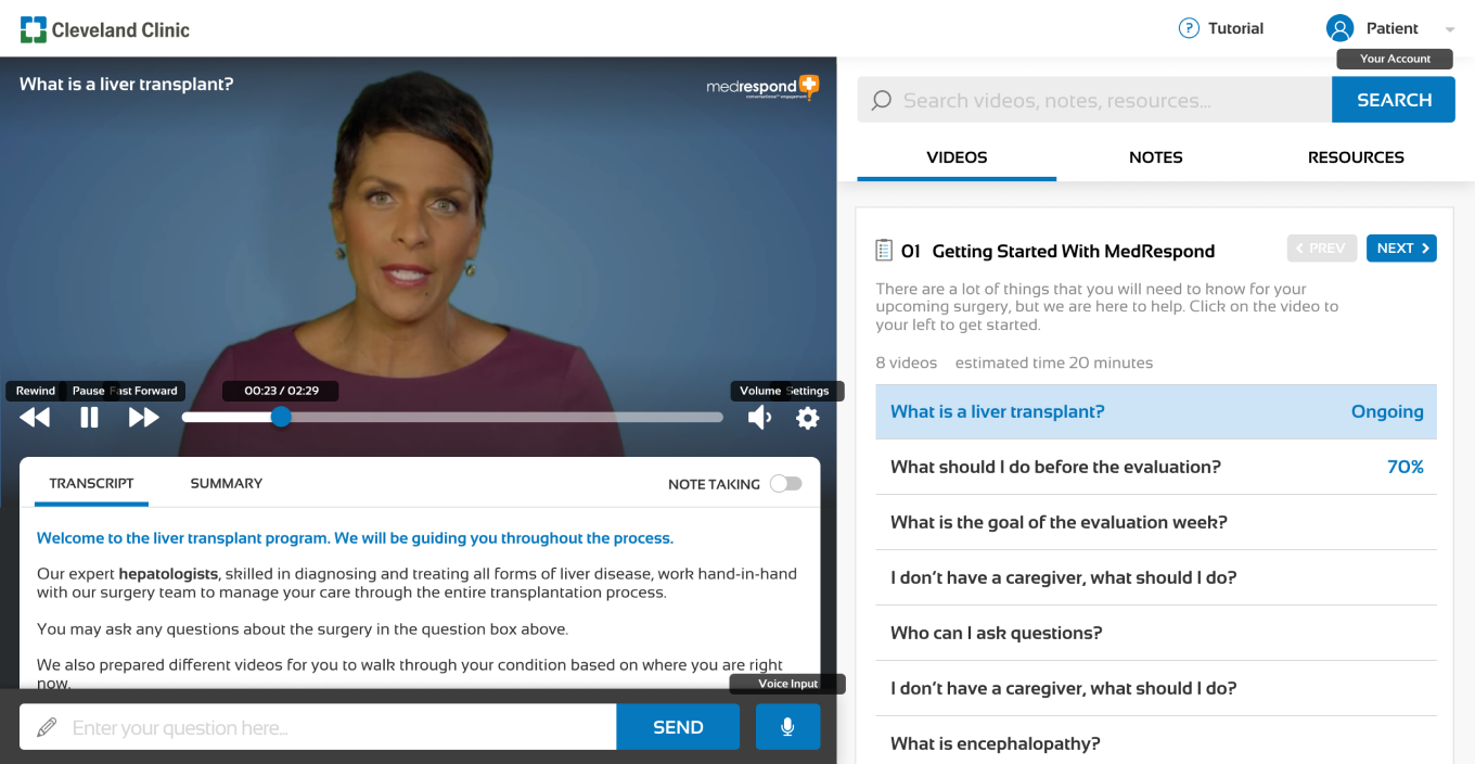
We made significant changes to the MedRespond navigation experience to increase the salience of key information and resources as well as help users more easily navigate the platform and track previous activities.
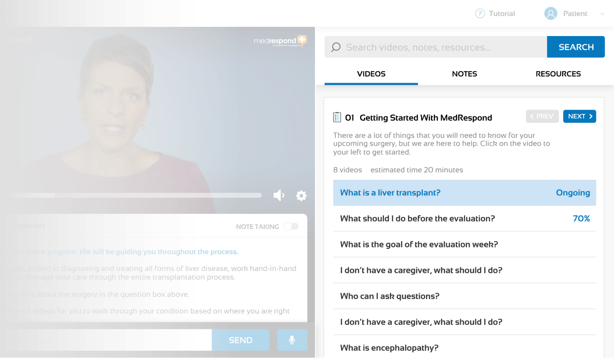
We designed a Table of Contents module where content is broken down into chapters. This way, users are better able to focus and digest the current chapter without being overwhelmed or distracted by content in other chapters. A brief chapter overview is also available for users to set expectations and mentally prepare for the upcoming videos. We provide estimated length of each video so that users may plan accordingly.
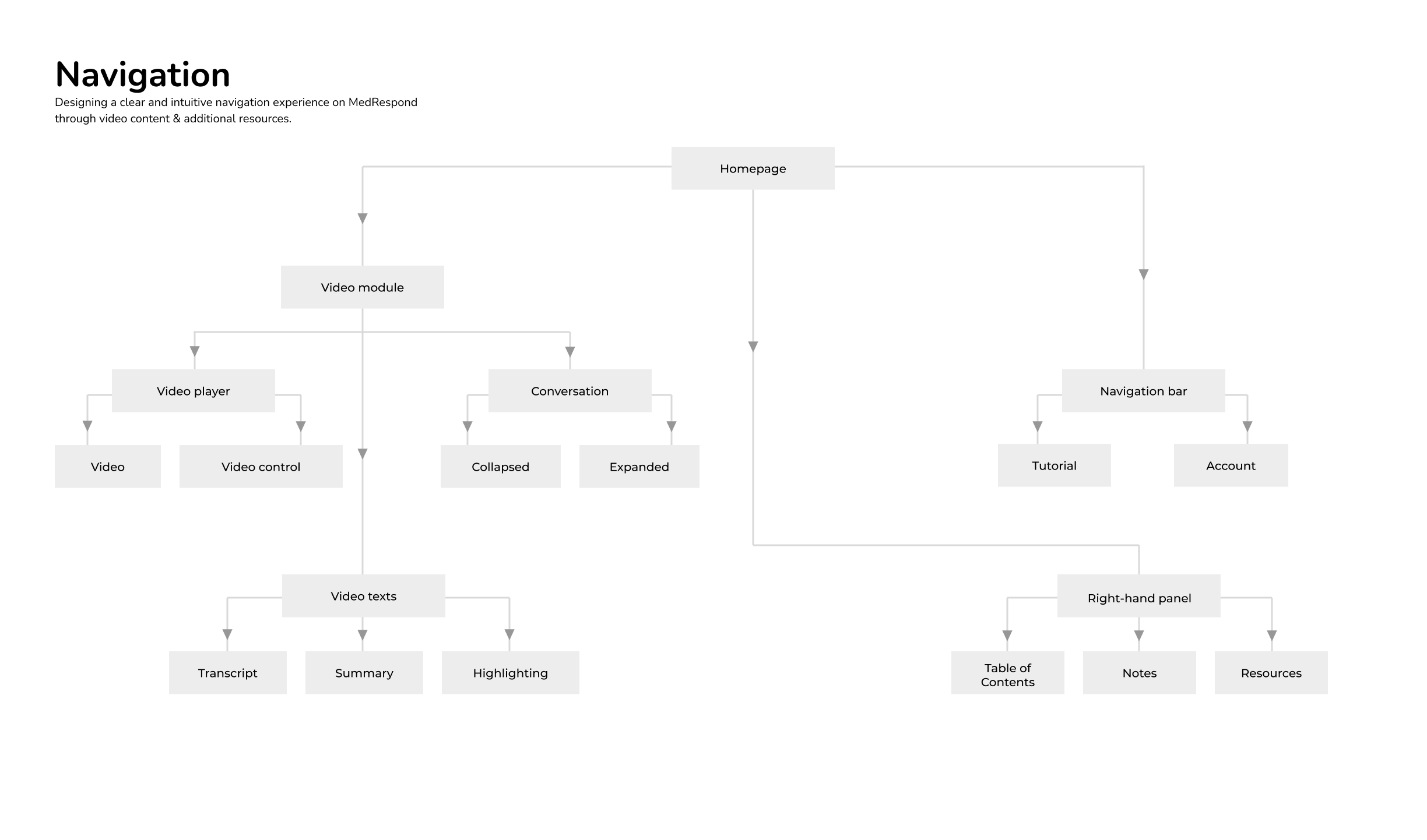
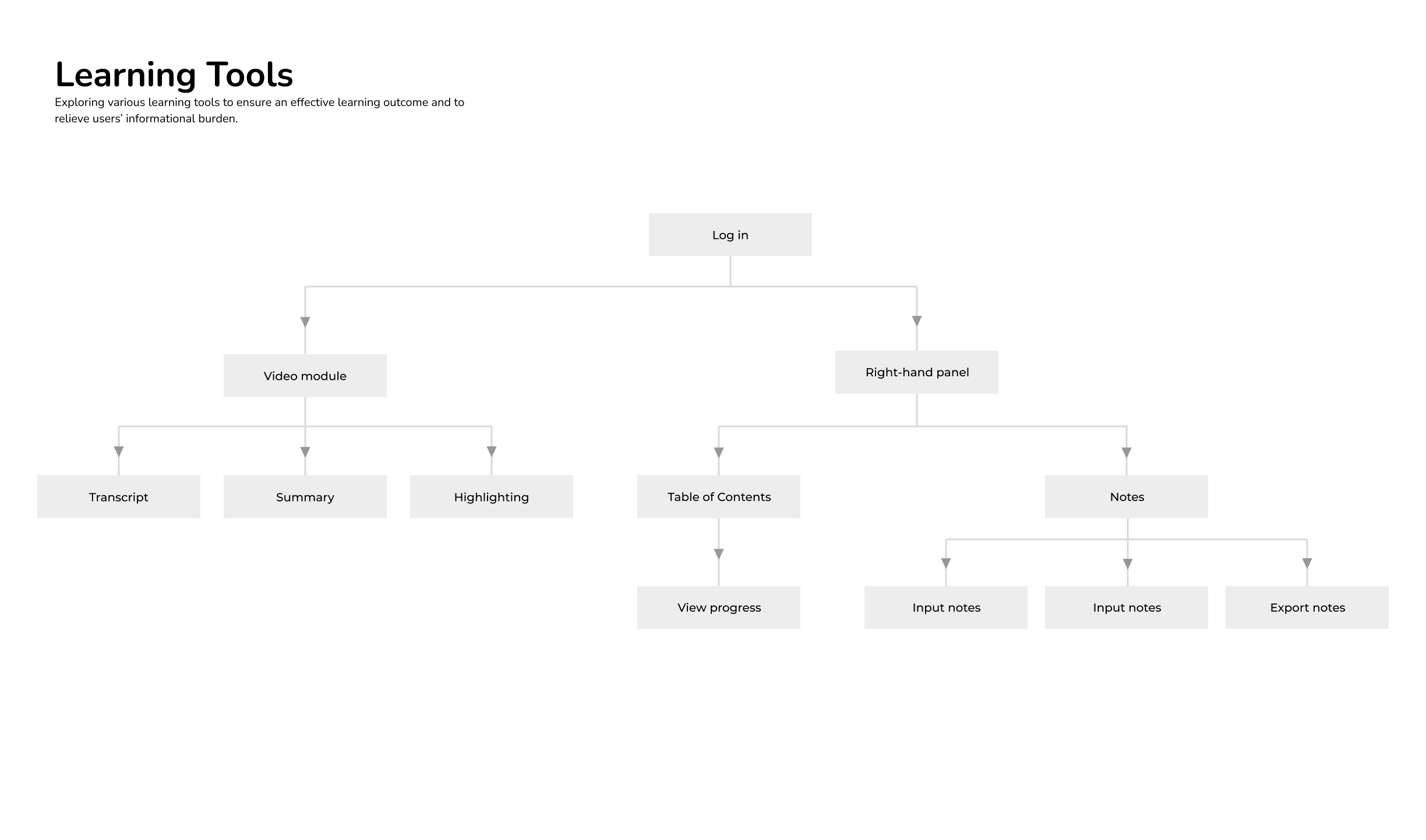
03: New Learning Tools
A whole additional set of patient and caregiver tools exists within the platform
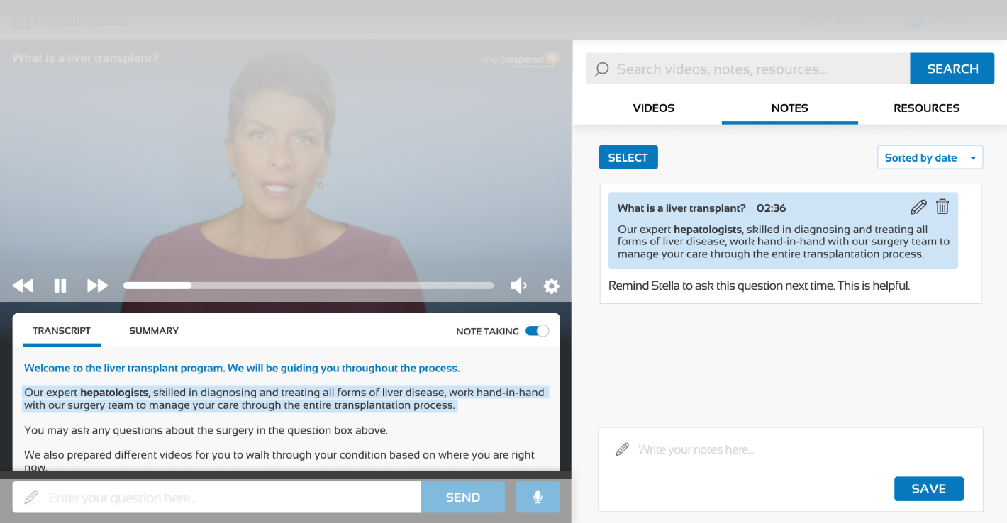
Our research showed that MedRespond can be better positioned to ensure learning outcomes and relieve informational burden. As such we demoed a set of features that help address key patient and caregiver unmet needs, including a dynamic transcript and note-taking abilities.
-
We designed information to be broken down in a way that better fits users’ mental models, so that users can better understand what “Resources” entails. In the main “Resources” page, we designed a clear information architecture so that users will be able to easily find useful information.
-
We included the Panacea Bullseye (from our artifacts section) as a way to show the patient which members of their care team are involved across every phase of the process, and how to easily contact them. Users can interact with the bullseye to find information relevant to their needs.
-
In order to provide flexible access for both user types, patients and caregivers will have separate accounts on the platform, as the journey is meant to be a joint experience. This way, the platform can serve both parties individually, as well as to encourage them to work as a team (as any good patient-caregiver relationship entails).
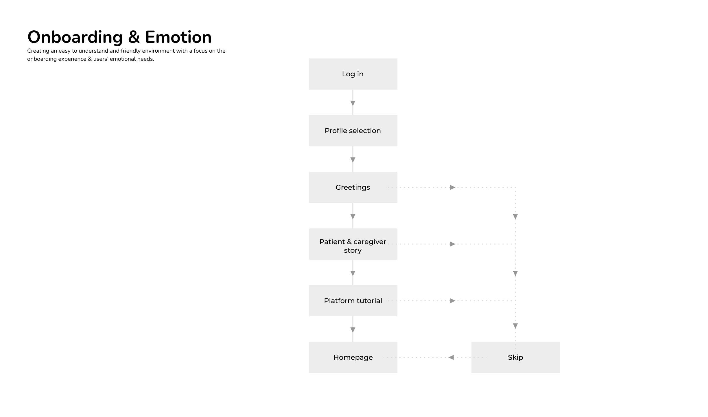
Onboarding & Emotional Sensitivity
Onboarding helps users feel validated and understand the MedRespond platform
From the very beginning, MedRespond and Panacea have been concerned with creating a positively affective experience that makes the user feel loved. With a focus on the onboarding experience and users’ emotional needs, we have created a friendly, easily understood environment that demonstrates emotional sensitivity to the liver transplant patient and caregiver experiences.
Through evaluation of the current MedRespond platform, as well as industry standard recommendations, we have identified onboarding as a key first touchpoint to both making the user feel welcomed and comfortable using the platform. In order to provide a tailored experience where the specific emotional and informational needs of patients and caregivers can be both tracked and met by the platform, we now ask users to identify themselves at the beginning of onboarding. However, we also wish to facilitate patient-caregiver teamwork through our platform, as a unified front is critical through this journey.

Interaction & Accessibility
Dynamic Transcripts: a necessary accessibility feature made more digestible

Transcripts are a crucial part of accessibility, as they provide users a way of ingesting content through a means other than audio. Transcripts allow users to rely on recognition over recall, easily navigating to the correct part of the transcript automatically instead of having to search for the desired content. Based on competitive analysis of online learning platforms and our heuristic evaluations, syncing transcript to the video provides greater flexibility, efficiency of use, and fulfills accessibility standards by allowing users to reinforce what they are watching through what they are reading.
Note Taking: identifying the important bits and pieces from a firehose of information

From our research surrounding patient-doctor communication, we learned that when answering questions, patients often need to stop and ask about specific jargon or medical terminology. Note-taking behavior is prevalent among patients & caregivers. In Note-taking mode, the user can highlight portions of the transcript / summary and add notes. Our goal is to provide users a way to take notes easily and in one central location, as well as the ability to facilitate conversations with their HCPs and family if they wish to share their notes. Notes are for the user’s personal records; they are not reviewed by MedRespond.
Accessible font sizes, colors, shadows, and shapes
Keeping in mind of the potential major audience of the MedRespond platform would be the elderly, we decided to adjust the font size into four levels: Title, Button, Content, and Tooltips.
Given that the real state is limited, we iterated and optimized the layout based on the accessibility principles. We reduced the number of colors we used, simplified the UI element styles to support cross-device experience, reduced shadows and rounded shapes to leave more space for important content.
Reach out if you would like a full case study!