Kairos
Multi-touchpoint stroke detection and triage for Allegheny Comprehensive Stroke Center
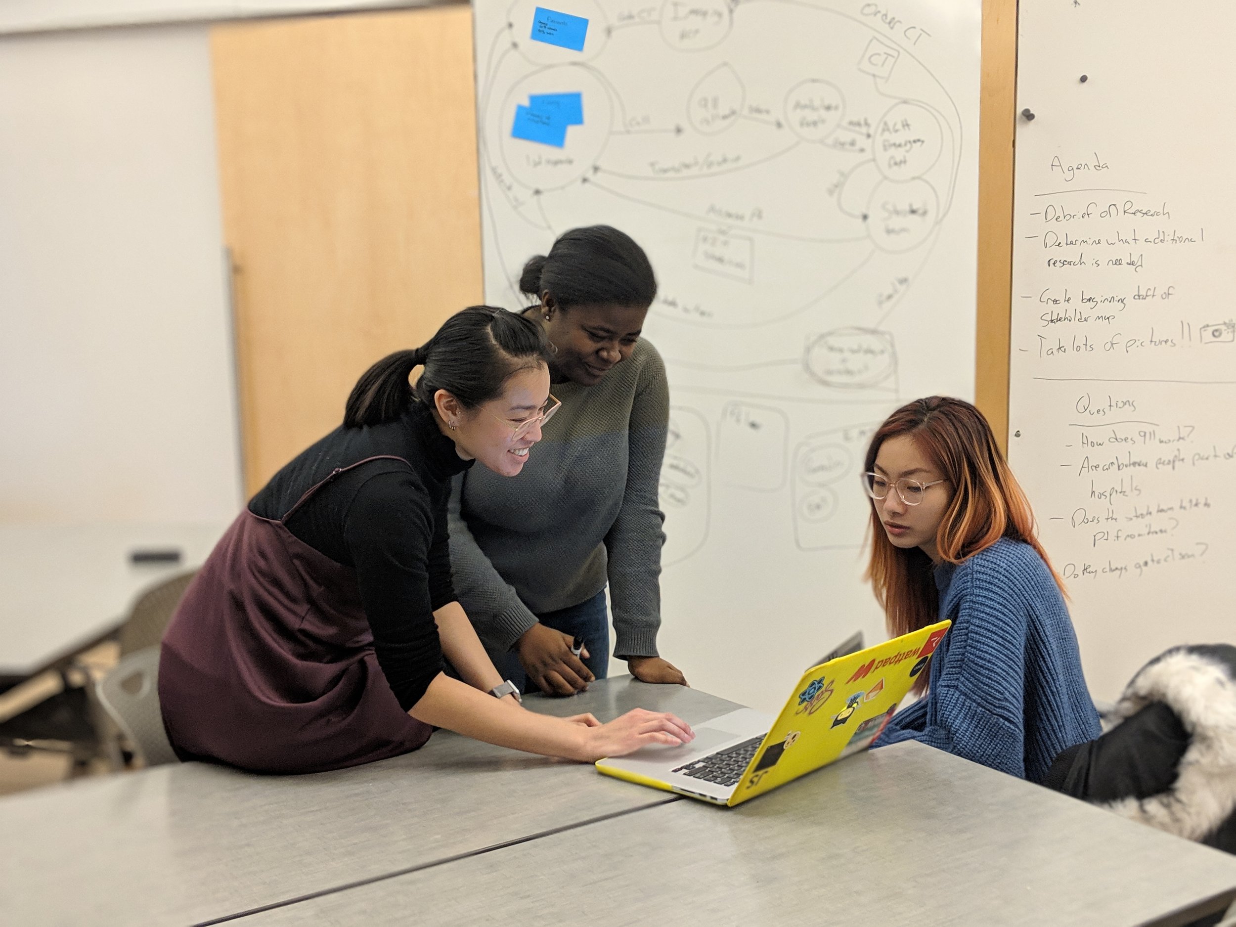
Team: Rayna Allonce, Maggie Chan, Ying Chen
Role: Product Designer
Timeline: 5 weeks, January 2019 - February 2019
Context: Interaction Design Studio Project
Mobile Service Design, UX Design, UX Research, MedTech
Overview
My team was challenged to consider the full functionalities of a native mobile app to design a mobile service for the Comprehensive Stroke Center at the Allegheny Health Network. This center provides inpatient and consultative care for stroke patients throughout western Pennsylvania.
Starting with secondary research into our problem space and primary research with a neurosurgeon at the Stroke Center, our design process consisted of consistently reframing the problem, reversing our assumptions, and constantly pushing ourselves to re-imagine the limits of what a mobile service could accomplish for our stakeholders.
THE PROBLEM
Patients who do not get timely care after a stroke risk significant long-term mental and physical impairment and health complications
Every 40 seconds someone in the US has a stroke
1 in 4 stroke patients have had a previous stroke
Only 10% of people who experience a stroke make a full recovery
People who get to the ER within 3 hours of first symptoms have less disability post-stroke
THE SOLUTION
A native mobile app that evaluates and triages high-risk patients and ensure they get critical, timely care
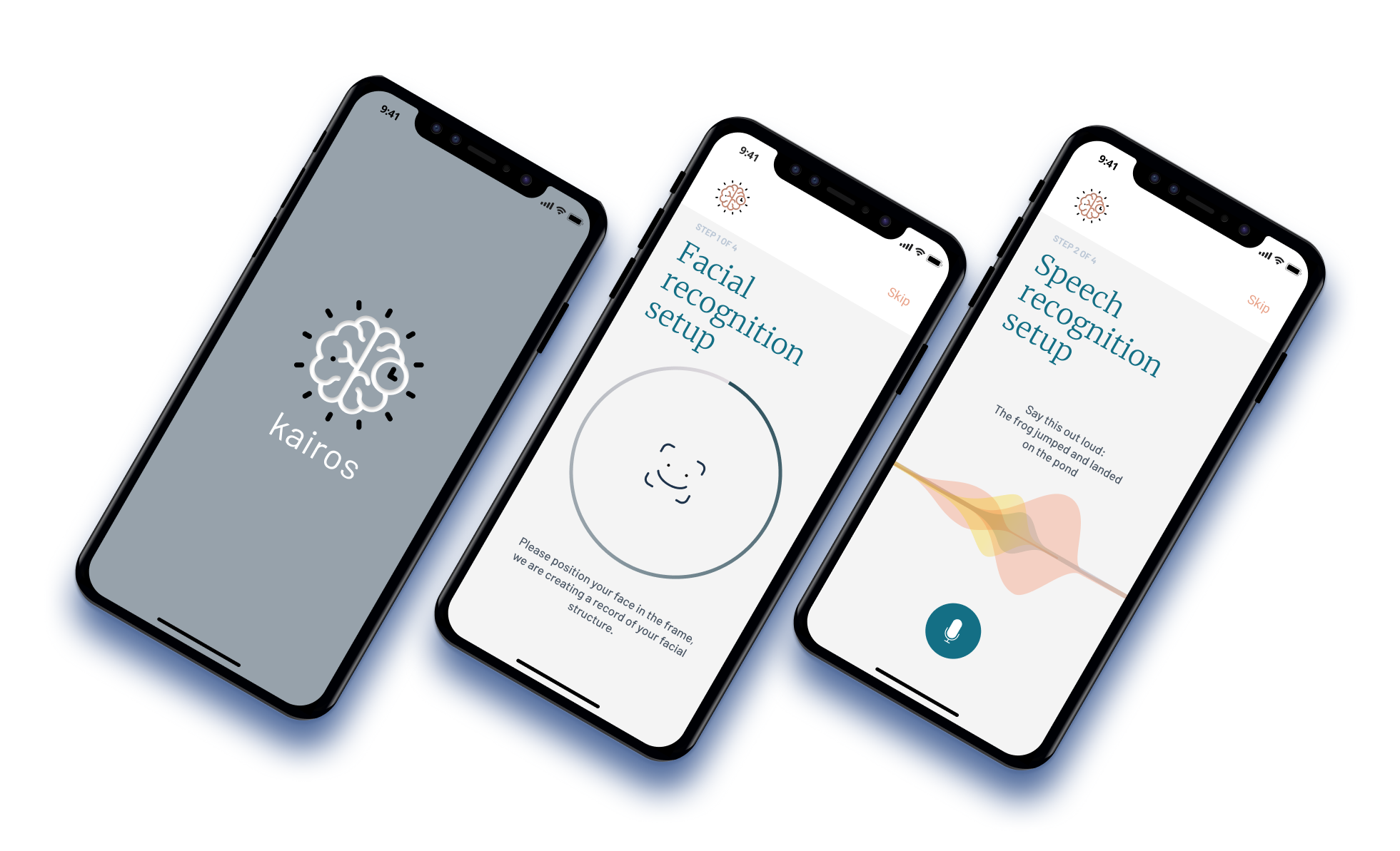
We developed a native mobile app specifically targeted for high-risk patients who have already experienced a stroke to quickly evaluate their symptoms using F.A.S.T. (which is a de-facto way to determine if someone may be having a stroke) and get critical, timely care. We chose this population for our MVP as patients who have already experienced stroke are at a significantly higher risk of experiencing stroke again, and can most benefit from an app that passively monitors for signs of stroke.
The 4-step F.A.S.T prompt the user to smile (Face will be asymmetrical), raise both arms (patient may not be able to raise both Arms to the same level), repeat a simple sentence (Speech will be slurred). If someone is having trouble finishing these tasks, the app will prompt the user to select a transportation method to visit the hospital as soon as possible.
Feature 1: Set-up of baseline
When prescribed at the doctor’s office, a nurse can walk the patient through a quick set-up process to establish a baseline of the patient’s face and voice, as well as capture emergency contact information and preferences for emergency travel.
Feature 2: Escalating Mobile Touchpoints
Rather than leave it to the patient to detect when they may be experiencing a stroke, our solution leverages mobile sensors such a phone or wearable’s accelerometer and gyroscope, faceID, and a user’s behavior to predict when they may need the assistance of the app.
when someone falls, the person’s Apple Watch will prompt to open the app
when someone google searches stroke symptoms on their smartphone, a notification will prompt the app to open
when someone’s face is drooping on one side, face ID will detect the facial change and a notification will pop up.
Feature 3: F.A.S.T. detection/verification of stroke
After opening the app, the user will go through a 4-step F.A.S.T process. The 4-step F.A.S.T prompt the user to smile, raise both arms, repeat a simple sentence. If someone is having trouble finishing these tasks, the app will prompt the user to select a transportation method to visit the hospital as soon as possible.
Design Process
Secondary Research
Building a shared understanding of our problem space
We started our process with a generative research on our topic. We deep dived into the stroke disease background, the role of various stakeholders, and understanding the role of the Allegheny Health Network and the AGH Comprehensive stroke center. To synthesize and document our findings we created several concept maps, as well as an informal background research deck for future reference.


Primary Research
Subject matter expert interview
We conducted a semi-structured interview with Dr. Eugene Bonaroti a neurosurgeon in the Allegheny Health Network. Prior to this interview we had been very interested in positioning our project as a solution to address any inefficiencies once the ambulance is on the scene, or when the patient gets to the hospital.
During our interview Dr. Bonaroti explained the entire stroke process, his role in stroke treatment as a neurosurgeon, the role of other physicians and healthcare practitioners in the space, and the various treatments available to patients upon getting to the ER, and the strengths and limitations of the Allegheny Health Network (for example, not all hospitals in the network are properly equipped to treat highly time-sensitive stroke patients, who then have to be transferred to a stroke center if they go to the “wrong” one first). He also gave us the most crucial piece of information for our project:
“Once [patients] get to the ER we have things in place. They’re going to get a CT scan within minutes. Someone will determine if they need a TPA or a surgery. If patients sit at home for 8-10 hours then it’s so much harder to help them.”
- Dr. Eugene Bonaroti, Neurosurgeon
This helped us identify that when considering stroke and the work of the Comprehensive Stroke Center, our team could add the most value by empowering at-risk patients to quickly detect stroke and arrange transportation to a facility that is best equipped to deal with strokes.
The actual problem was in getting patients to the ER, and quickly. This led us to our solution, Kairos.
Ideation
Reversing our assumptions
We started our ideation with a “reverse assumptions” design activity. Each of us first came up with several assumptions on the current problem space. We then reversed the assumption and used that to challenge the prevailing assumption. Based on the opposite statement we came up with, we brainstormed ideas on how a mobile service can help or support the pain point. For example, one assumption we had was “you need to call 911 to identify if someone is having a stroke.” The reverse assumption for the statement was “you don’t need to call 911 to identify if someone is having a stroke.” The idea we came up with was “when symptoms occur, someone will identify them as a stroke, and the patient will be sent to the hospital.” This idea later became a key part of our final solution.


Digging deeper with “20 Questions”
In this exercise, we reviewed our stakeholder map and identified the interaction between first responders and the hospital shows the greatest promise for our team to succeed. The problem we identified was “it takes a really long time between experiencing a stroke and getting proper treatment.” We then made a list of 20 questions about the problem and how to solve it by starting with the most basic questions, then expanding the scope of questions and then probing even deeper.


Initial conceptual design with collaborative sketching
Looking at the ideas we generated with Reverse Assumptions and 20 Questions, we selected the concept of using Uber/Lyft as an alternative transport to the hospital when a stroke occurs. Each of us got a sharpie and several pieces of paper and started sketching user experience and user interfaces. After 3 minutes, we passed our ideas to the left, and added on and completed each other’s ideas. Although Uber/Lyft wasn’t the final solution we came up with, we still gained some insights and ideas for our mobile screens by doing this exercise.
Iteration
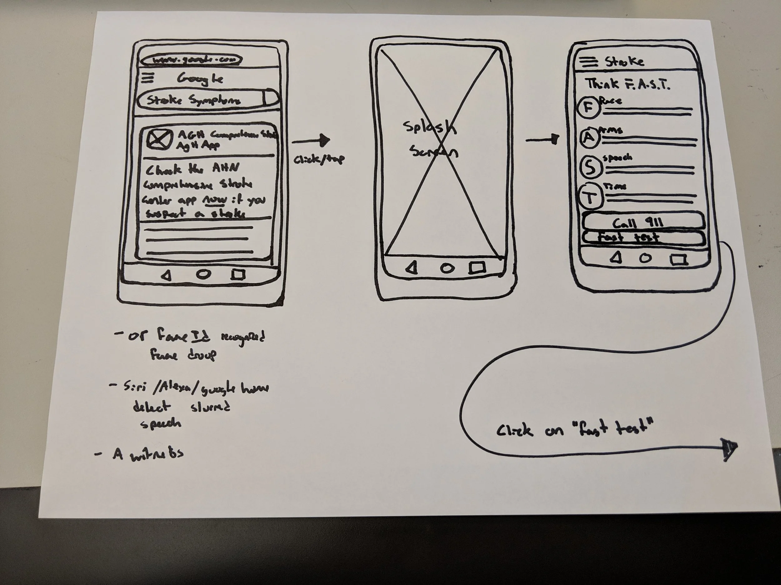
Low-Fidelity
During the low-fi sketching phase, our main goal was to present a clear user flow while using the app. We imagined a user being alarmed at several touchpoints:
when someone falls, the person’s Apple Watch will prompt to open the app
when someone google searches stroke symptoms on their smartphone, a notification will prompt the app to open
when someone’s face is drooping on one side, face ID will detect the facial change and a notification will pop up.
After opening the app, the user will go through a 4-step F.A.S.T process - which is a de-facto way to diagnose if someone is having a stroke. The 4-step F.A.S.T prompt the user to smile, raise both arms, repeat a simple sentence. If someone is having trouble finishing these tasks, the app will prompt the user to select a transportation method to visit the hospital as soon as possible.


Medium-Fidelity
From low-fi to mid-fi, we used Figma as our collaborative tool and digitized our paper sketches. One piece of feedback we got from critique was we should be aware of the amount of text we’re presenting on the mobile screen. Since the user who would be using it might be in an urgent situation, he/she might not have the time to attend to every single detail. Another question we started to consider was the name and the overall look and feel of the app.
High-Fidelity
For our high-fidelity screens, we focused on cleaning up the visual and making sure all the screens look consistent. For our app, we used the name kairos - an opportune moment, which we found appropriate for the purpose of the app which is to detect stroke at an early stage. We chose a professional and calm color palette for the look and feel. In addition, we used Merriweather and Barlow for the typefaces.