Atlantis Hub
A data-driven environmental display

Team: Rayna Allonce, Wuyang Wang, Jiachen Hu
Role: Product Designer
Timeline: 2 weeks, October 2018 - November 2018
Context: Interaction Design Studio
Information Architecture, UX/UI Design, Transportation
Overview
My team was tasked with creating a highly readable and easy to understand data-driven display for a transportation hub serving three modes of transportation. Driven by an understanding of key stakeholders and users, exploration of the data, and careful attention to design concepts such as typography, color, composition, and motion, my team and I designed a display that is versatile, user-centered, and informative.
THE PROBLEM
How might we take an evolving transportation data set and make that data and its changes accessible to a diverse audience at a transportation hub?

Our original raw data set, containing various information for the planes, trains, and ferries that go through Atlantis Hub
The Atlantis Hub services a wide variety of users and three separate modes of transportation: plane, train, and ferry. Our client, the transportation director of the Municipality of San Juan Islands, had the following requirements:
A highly readable displays of changing transportation data
A means of educating the public about the ease with which travelers can make itineraries by combining plane, train, and ferry trips through a new program, the PFT Pass
THE SOLUTION
A versatile, user-centered display that incorporates key human factors concepts to ensure that information is quickly and easily consumable
Individuals going through a transportation hub are often inundated by a density of auditory, visual, and cognitive stimuli. We focused specifically on how might we use language, typography, color, composition, and motion to reduce cognitive load and facilitate the quick and easy absorption of key information for a wide range of users.
Still image
Gif showing motion
Design Process
Creating a shared understanding
Understanding our users and stakeholders
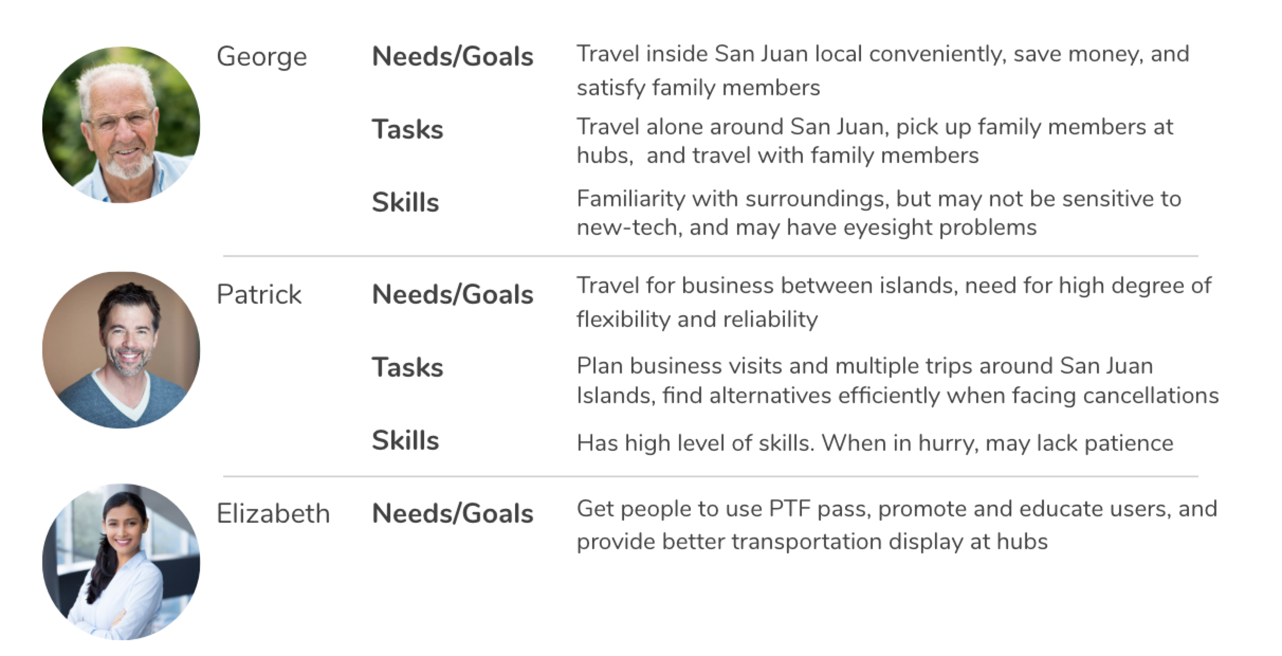
We considered three main personas:
“George" — a long-time resident of the San Juan Islands
“Patrick” — a business traveler
"Elizabeth” — our client
We later saw that it was necessary to get a more diverse perspective and considered George’s family as well. His family includes his daughter, her partner, and their three children.
Modeling and understanding the data
Following an understanding of the users and stakeholders, our next step as a team was to understand the data. Through a careful examination and modeling of the raw data, we noticed that there were two key categories that we could concentrate on to build informative information models: transportation mode and location.


All-Encompassing Model
We built an all-encompassing model to understand the overall structure of the raw data from a transportation mode view, and got a basic understanding of the relationship among categories.
Route Visualization
The route map makes implicit information explicit. For example: it’s easy to see from the map that trains only run on San Juan Island with Atlantis Hub being the central station, and that Roche Harbor and Friday Harbor have all modes in them, etc.


Location Based Informational Model
The location based info model mainly helped us clarify two things:
The administrative hierarchy of various locations
Transportation accessibility at specific locations.
Mapping the data to the personas
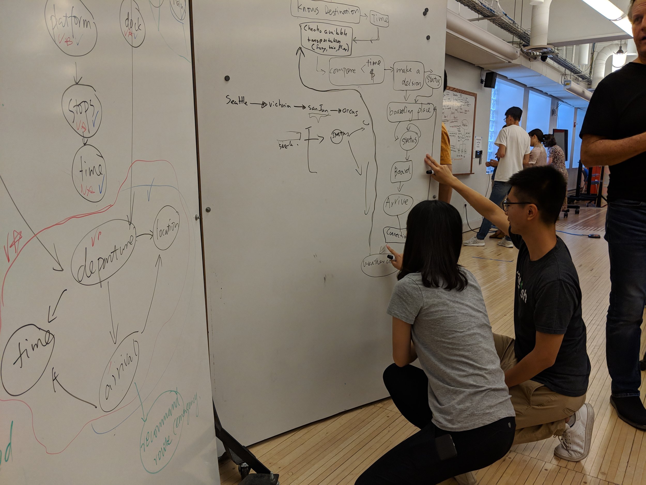
Sequence model from the mindset of the user
To map the data to the personas, we made a sequence model that spoke out users’ mindset during their decision making and boarding processes. We embedded both Patrick and George’s considerations and listed potentially useful data categories by analyzing users’ needs at each stage. This model was then implemented in our iteration 3&4. For example, in the model we found out that for both Patrick and George, the first thing that came into their minds while making a decision is ‘Where am I going?’. Therefore final/connecting destination are crucial information for users. In Iteration 3&4, we created the destination panel (the left panel) to tailor to this mindset, making destination info the point of entry for users, and helping them to figure out possible connections.


Design Iteration 1
Hand drawn sketches of data-driven display
Our main goal for this process was to generate ideas as broadly as possible. We tried different arrangements of data including by location, by transportation mode, by departure time, with/without maps, etc


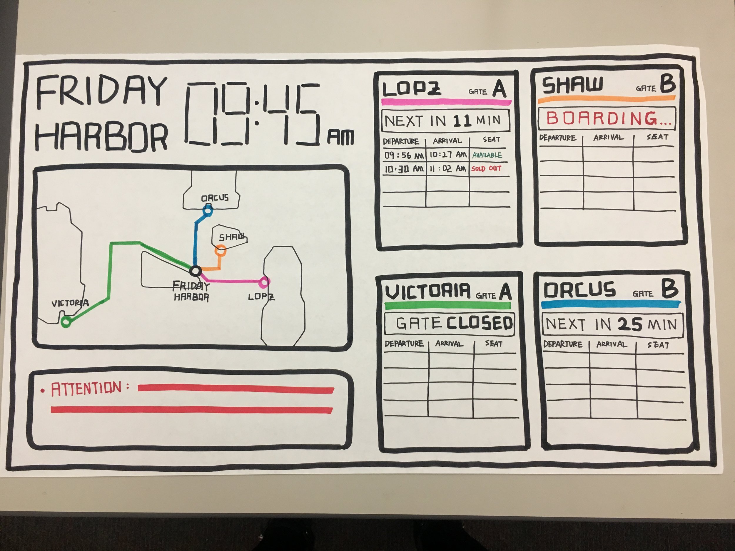


Feedback
The metro-style map was concise and easy to digest; the idea of arranging data by location would be helpful to guide users’ attention. However, it was also clear that the sketches were created by distinct individuals without a central theme or style across all models.
Reflections
We learned from iteration 1 that our final deliverables for each section should have a coherent and unified feel to it, and that we should continue to put the user in the center of our design activities.
Design Iteration 2
Digital data-driven display
In iteration 2, we decided to define Atlantis Hub as an central information hub of the whole San Juan Islands. Therefore, we created a display that could handle the data of all known modes and routes, no matter they had direct connections with Atlantis Hub itself or not.
Feedback
The design didn’t solve the proposed use case efficiently
It might be confusing to combine the destination oriented arrangement with the departure location oriented one.
The left-up panel took up too much space.
The metro-style map worked very well, but the cards next to them were relatively hard to understand.
Reflections
During iteration 2, we were so focused on integrating the large amount of information into one single display that we, to some extent, ignored users’ decision making mindsets.
Feedback received reminded us to go back to the sequence model we built, and dive into specific scenarios before working on visual designs.
Design Iteration 3
Digital data-driven display with motion
We went back to our original models where we mapped the user to the data and used this to inform an overhaul of the display. We realized after our iteration 2 critique that we had strayed from our original goals and models. We also added a significant amount of animation to show all the use cases (cancellations, delays, data updating, screens shifting).
Feedback
Here we learned that we were a bit overzealous with our use of motion, especially for the purposes of a critique. Because so many things were moving at once it was difficult for our audience to process the various information. The movement was also a bit distracting because there were various components moving in different ways (up down, left to right, switching, pulsating).
Reflection
Our task for the next iteration was to simplify and reduce the visual noise in our display to enable users and audience members to be able to follow along without being overwhelmed by the motion and color.
Design Iteration 4
Digital display and VUI control
Digital Display
In this iteration we reduced visual noise and animations as well as experimented with using gray for the point of entry. We wanted this to be sufficiently different for the rest of the panel that it draws the eye, but not overwhelm the rest of the display.
Control: Voice User Interface (VUI)
Through task analysis we uncovered a need for novice users and tourists to have additional means of getting more information. To solve this, we integrated a voice-controlled virtual assistant into the display named AVA (Atlantis hub Voice Assistant). Users can control the display by asking specific questions (using voice) through a speaker close to the display. It is mainly designed to provide travelers with information on the following two aspects: how to get their destinations (directions), and what they can do at the destination (attractions).
We wanted to design a control that would meet user needs by allowing them to quickly and efficiently parse through the data on our display and retrieve their desired information. We chose to do this through a natural language interface as we believe this interaction would both delight and fulfill the needs of our users. Given that conversational agents are becoming ubiquitous in our daily lives, AVA will work to ensure that the Atlantis Hub display is a truly modern experience.
Feedback
We learned that with all our animations and color, the gray, “where are you going” panel of our display still wasn’t the most exciting thing on the screen. However, we were challenged by the question of whether or not it needed to be the point of entry to begin with. After all, after the first 5 or so seconds a novice user no longer needs the scaffolding provided by this section and an expert user like Patrick or George may not even bother to look at it. This gave us a lot to think about with regards to the user’s need, our use of color, and the need to (or lack thereof) to have our leftmost panel be the point of entry.
Reflection
As a team we decided that for our next and final iteration, our task was to further simplify, streamline, and make sure that all the components were fulfilling a user need.
Final Design Iteration
Digital display and a VUI control
For this iteration we returned to the subdued gray color pallet of our original display. We learned, through review of human factors text, that using a grayscale background is not only easier on the eyes, but better directs users to the most important sections of display. This is particularly important as we use a lot of color to highlight key points.
We were also still concerned with the availability of information in the ferry section of the display. In our past iterations it would take several long seconds for the screen to cycle through the various options. We removed several less user-relevant sections (giving us more space to work with), and tried out several ways of laying out this section to see what made the most sense to novice users (people who weren’t us). We did a think aloud with one of our classmates from another section and had him go through various tasks using the display. This helped uncover the importance of having the destination and arrival times of the non-highlighted destination locations always available on the screen, and also highlighted
Concerning AVA, our control, we added the greeting “Hi, I’m AVA!” to her information panel to more fully embody her as a presence in the hub, as well as to make her seem more friendly and approachable. We hoped that this would encourage users to step up and talk to her.